Brand vision
Duncan & Todd
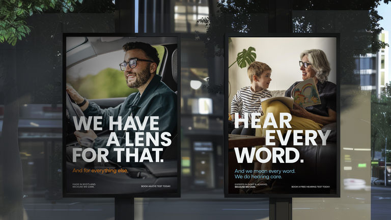
How do you make one of Scotland’s biggest sight and hearing specialists more visible? You transform their brand. And in turn, supercharge their business. We started, as we always do, with the WHY - the brand hook. Three words that summarise why they do what they do. Words that set them apart, and that everything they do hooks back into.
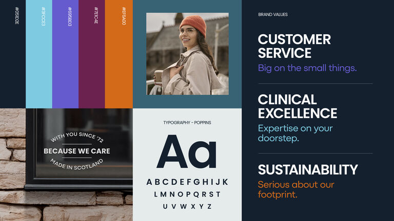
BECAUSE WE CARE.
Simple and campaignable. It’s rooted in their ethos, positioning them as caring about the big things like clinical excellence, the environment and community. But also, about the small details. The personal service offerings that resonate with customers.
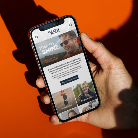
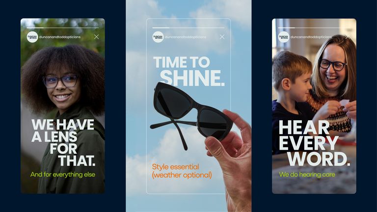
We rooted the brand in its home - Scotland. Drawing colours from the Scottish landscape to evoke a sense of nature and heritage. We evolved the logo, giving it a contemporary edge and developed a new, natural image style that captures ‘moments in time’. Pulling together inspiration from our unique surroundings created a visual identity deeply embedded with a sense of place (so they are seen more clearly).
But a brand is more than just a logo, font and colours - it’s how you sound. We created a distinct tone of voice (so they are heard more precisely) which is engaging and immediate. Adding a dash of Scottish humour where appropriate. The new tone works across the business, in the new vision, mission and values we evolved together. Aligning the brand to where the business is now and where it’s going.
We pride ourselves on the effectiveness of our solutions. The new brand work has had a seismic effect on their business. Repositioning them and helping to exceed their growth ambitions.
Duncan & Todd - a truly Scottish brand that’s big on the small things.
